In today’s competitive retail landscape, retail packaging design plays a crucial role in shaping consumer decisions. With thousands of products vying for attention, standing out on a crowded shelf is no easy feat. Brands that understand the importance of eye-catching product packaging and implement strategic design choices can significantly increase their sales and customer retention.
Why Retail Packaging Design Shelf Impact Matters
Your product only has a few seconds—typically less than five—to catch a shopper’s eye. This is known as the 5-second rule, and it underlines the importance of strong visual branding for packaging. If your product doesn’t grab attention quickly, it’s likely to be overlooked, no matter how good it is.
In retail, first impressions are often final impressions. Great packaging can influence purchase decisions even before a customer reads the label or checks the price.
Understanding Your Target Audience
Effective custom packaging design starts with understanding who your ideal customer is. Packaging aimed at eco-conscious millennials will look vastly different from packaging meant for luxury shoppers or bargain hunters.
- Luxury shoppers expect elegance, premium materials, and minimalist design.
- Eco-conscious buyers are drawn to recycled materials, earthy tones, and sustainability messaging.
- Budget-conscious customers prefer clear, value-driven messaging and bold visual cues like price tags or promotions.
Your design should reflect the desires, values, and pain points of your audience to make an emotional connection.
Color Psychology & Typography
Color is one of the most powerful design elements in packaging. It’s not just about being bright—it’s about being right.
- Red evokes urgency and energy.
- Blue conveys trust and reliability.
- Green symbolizes health and sustainability.
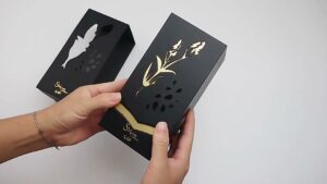
- Black suggests luxury and sophistication.
Pairing the right colors can make your product jump off the shelf, especially when contrasted against competitors.
Fonts That Tell a Story
Typography should enhance readability while also conveying your brand’s tone. A modern sans-serif font might suit tech gadgets, while a handwritten or serif font could align with artisanal or vintage products. Avoid clutter and choose no more than two complementary fonts to maintain harmony and readability.
Simplicity vs. Information Overload
Clarity trumps complexity. While it’s tempting to include every feature and benefit on the packaging, too much information can overwhelm and confuse.
Here’s how to simplify effectively:
- Use a strong visual hierarchy: Headline → Key Benefit → Supporting Info
- Leverage whitespace to give breathing room
- Use icons or infographics to replace long text
A clean, bold design helps your product stand out, especially in visually noisy retail spaces.
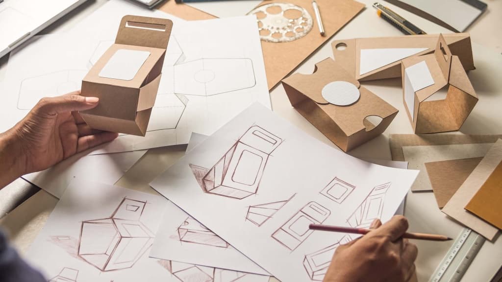
Unique Shapes & Structural Design
While rectangular boxes are practical, unique packaging shapes instantly attract attention. A triangular, hexagonal, or circular design can make customers do a double-take.
However, creativity must balance with practicality. Consider:
- Stackability: Will it sit well on shelves?
- Shipping efficiency: Will it add extra cost?
- Durability: Will it protect the product during transit?
Structural innovation can boost shelf appeal and user experience when done right.
Textures, Finishes & Materials
Textures and finishes aren’t just about looks—they’re about feel. Adding texture to your packaging can enhance perceived value and draw customers in through the sense of touch.
Popular finishes include:
- Matte: Modern and soft to the touch
- Glossy: Vibrant and eye-catching
- Embossing/Debossing: Adds depth and luxury
- Foil stamping: Gives a premium, shiny finish
Embrace Sustainable Packaging
Consumers are increasingly valuing eco-friendly materials like recycled cardboard, compostable plastics, and plant-based inks. Incorporating sustainable design isn’t just trendy—it builds brand loyalty and aligns with changing consumer behavior.
Clear Branding and Consistency
Every product should reinforce your brand identity, whether it’s the first product or the fiftieth. Custom packaging design must incorporate brand colors, fonts, tone, and logo placement in a consistent and recognizable way.
Maintain visual coherence across your product line:
- Create a template or style guide for packaging
- Use similar design elements with slight variations for different SKUs
- Ensure your packaging reflects your brand values and voice
Testing Shelf Impact
Don’t rely on assumptions. Use mock-up displays, A/B testing, or focus groups to gauge shelf impact before committing to a large production run.
Here’s how to test effectively:
- Compare multiple designs side by side
- Observe how quickly participants identify or recall your product
- Ask what emotions or messages they associate with the design
Real-world testing helps you avoid costly mistakes and ensures your packaging is optimized for success.
Final Thoughts
Creating eye-catching product packaging that drives sales is both an art and a science. From color choices to typography, from structure to sustainability, every detail matters. By understanding your audience, designing with purpose, and testing for real-world results, your brand can develop retail packaging design that doesn’t just sit on shelves—but sells from them.
Whether you’re revamping your current line or launching something new, apply these shelf impact packaging tips to create packaging that truly pops. After all, great packaging doesn’t just contain your product—it sells it.